Forum tip: Always check when replies were posted. Technology evolves quickly, so some answers may not be up-to-date anymore.
-
 Carl Farrington
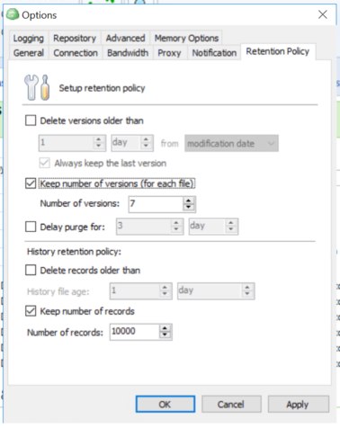
0What's with the broken tab-ordering in the configuration UI? It doesn't give a very professional / well tested impression.
What I mean is when you are in the configuraiton, and you are typing e.g. an encryption password in a box. You hit tab, to tab down to the 'verify password' box, but it shoots off miles away -
 Carl Farrington
0It's all over the place really.
I have a backup running now so i don't want to mess too much, but certainly on the backup provider 'consistency check' screen where you fill in the encryption password, and also, in the general options screens, as least on this screen it's all over the shop:

-
 Julia
4Thanks for the details. I have submitted a change request for that. We are going to review the dialogs and wizards to fix tab ordering issues together.
Welcome to MSP360 Forum!
Thank you for visiting! Please take a moment to register so that you can participate in discussions!
Categories
- MSP360 Managed Products
- Managed Backup - General
- Managed Backup Windows
- Managed Backup Mac
- Managed Backup Linux
- Managed Backup SQL Server
- Managed Backup Exchange
- Managed Backup Microsoft 365
- Managed Backup G Workspace
- RMM
- Connect (Managed)
- Deep Instinct
- CloudBerry Backup
- Backup Windows
- Backup Mac
- Backup for Linux
- Backup SQL Server
- Backup Exchange
- Connect Free/Pro (Remote Desktop)
- CloudBerry Explorer
- CloudBerry Drive
More Discussions
- Terms of Service
- Useful Hints and Tips
- Sign In
- © 2025 MSP360 Forum


