Comments
-
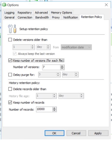
dodgy tab-order in configuration UIIt's all over the place really.
I have a backup running now so i don't want to mess too much, but certainly on the backup provider 'consistency check' screen where you fill in the encryption password, and also, in the general options screens, as least on this screen it's all over the shop:

Carl Farrington

Start FollowingSend a Message
- Terms of Service
- Useful Hints and Tips
- Sign In
- © 2025 MSP360 Forum
